Fascinating Image
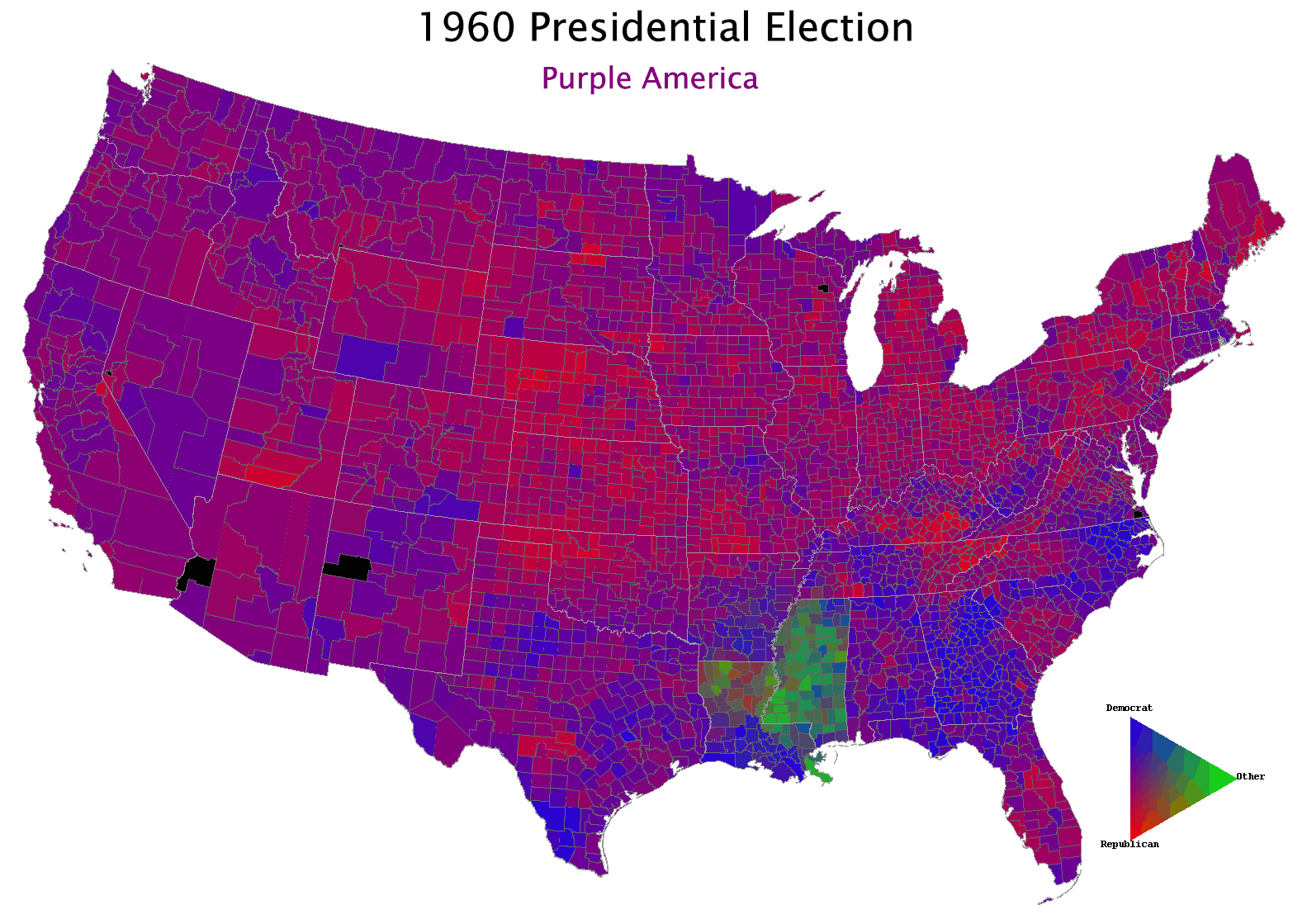
Check this out. I came across it while looking some things up for my last post. It's a "red/blue" county-by-county map of the US over the last 40-ish years. Extremely fascinating to watch the progression of this country from one hue to another, and then try to remember what political event or character influenced the trends in a given year. One twist to this map: rather than a continuum of shades between red and blue with purple in between, there is a triangular palette here, with "green" being a stand-in for "other". Makes it very very clear just how much of a spoiler H. Ross Perot was in 1992 (and how important Bill's Southern charm was), as well as some before-my-time Southern chaos in the 60's. (Wallace, I think? One of you old ex-hippies can fill me in here so I don't have to google it).
Labels: politics
posted by Benjamin at 9:53 AM
![]()
![]()

2 Comments:
Fascinating indeed. And annoying. I wish you didn't have to wait for it to cycle through but could stop it and scroll back and forth. How did you get to this originally? I found the guy's home page thinking I could get a more useful way of scrolling through, and though this research is linked, the map you found is not linked from there.
Yeah, that was Wallace in 68. In the 1960 race, the Byrd/Thurmond ticket took Mississippi. Byrd was a reactionary Democrat, like Wallace. The Democrats have largely been taken over by a different, much more successful kind of reactionary.
I was fascinated by several elections. Carter was also very strong in the South in 1976. I thought the 1980 candidacy of John Anderson would be more discernible in the graphic. He did very well for an independent, grabbing nearly 7% of the vote. But he did get any electoral votes and apparently did not do well enough in selected precincts to really show up in the colors. Another factor that is not well captured is the huge effect that fringe candidates can have in close elections, e.g. Nader and Buchanan in 2000 (Buchanan got a sliver of the vote in Florida, but that was enough to make it as close as it was.)
Yeah, I think it's an animated GIF rather than a slideshow or something useful like that. I think I found it directly from a Google link on a search for "electoral county map 2004", or something like that. Or it may have been a Google Image search. Can't quite recall now.
Post a Comment
<< Home